
Tuesday, July 26, 2011
On Burlap 2
I've spent the last two weeks working out the following picture. It is 21"x42" mixed media (acrylic and spray on enamel paint) on burlap. The burlap has two coats of brushed on gesso followed by two background coats (layering) of acrylic paint. The words were printed using a lino-block. The bottle was sprayed on with the use of a large stencil I used created after photographing a glass Coke bottle. I'll be entering this piece in a local juried art contest. The theme is 'Food' (as mentioned in a previous post). This piece deals with the use of well-proportioned sex appeal to sell products. Interestingly, although the bottle fits the proportions of an 'ideal' female, the bottle is also distinctly phallic in shape yet this comparison does not as easily enter the consciousness. This bottle is intended to be appealing (yes, sexually) and it continues a tradition of forcing a model of an 'ideal' figure on women.
 Food Appeal. July 2011. 21"x42". Mixed media on burlap.
Thursday, July 14, 2011
On Burlap

Detail of Say Something.
A little over a week ago I started a new project. I've been interested in experimenting with different, somewhat unconventional materials. I found burlap on sale for under $2 a yard. Excellent! I purchased some burlap and primer and got started.

Burlap.
The first few steps involved stretching the burlap to a piece of plywood, stapling it in place and then priming it. I used Pratt and Lambert SuPrime interior latex wall primer/sealer, white for the job. I know that not using a standard gesso-type primer will ultimately have implications, but, I'm interested in the end effects and I have mixed feelings seeing art as something permanent. It's more romantic to see at as an ephemeral experience.

Burlap stretched, stapled and primed.
While the primer was drying I had a chance to contemplate a background. An artist friend of mine has been encouraging me to create backgrounds and then produce works on the created backgrounds. I decided to roll primary color and black acrylic paint over the entire surface. After this dried I rolled a layer of black acrylic over it all. The texture of the burlap created several well in which the final black paint layer did not settle, thus producing pockets of color from the first layer of paint.

Prepared painting surface. Overall size is approximately 24"x48".
I now needed to get down to design of the image(s) to place on this newly created surface. Starting with the prompt of consumption, I did some sketches of mouths sucking in everything around them. My first step in developing the sketch into something to paint on the surface was to photograph a study. Since I was home alone at the time I took some pictures of myself with the desired expression and used the following as my model.

Reference image for painting.
To facilitate the creation of a monochromatic image for the painting, I manipulated 'contrast,' 'exposure,' etc., and ended up with the following:

Color adjusted reference image.
I proceeded to create the sketch of this image on paper.

Sketch of reference image. Approximately 6"x8".
With my image ready, it was time to scale it up and to 'box in' the desired frame. I did this and sketched the image at the final desired size.

'Scaled up' sketch.
The next step was to create the stencil for creating the image on the painting surface. To do this I hung the above sketch on a window and covered it with paper. Through top layer I was able to discern the above sketch and proceeded to trace outline for creating my stencil.

Tracing the sketch in order to create my stencil.
After this was complete I attached the stencil outline to Bristol paper which would provide the rigid structure necessary for my stencil. Using a sharp blade I cut out the stencil. Using masking tape I fixed the stencil to the burlap and spray-painted the image.

Image spray-painted on burlap.
The bars near the nose and brow show how the entire stencil was held in place. I needed to cover these stencil supports and did by cutting another stencil which was just big enough to remove these conspicuous lines. Following this I blocked the entire area in with white acrylic paint to create a more uniform layer of white.

Face complete.
The next step was to create the wavy lines being sucked into the mouth. I created another stencil and decided the wavy lines should be yellow--bright, glossy, sunshine yellow. In order to make the yellow as bright as I wanted it to be, I applied three undercoats of white spray paint before applying three coats of the high-gloss yellow spray paint.

Addition of wavy, yellow lines.

Wavy, yellow lines now done.
At this point I felt the picture was near complete. However, during the process of spray-painting, although the stencil was taped down, it lifted in some places and the spray paint 'bled' into the black spaces. In fact, viewed full size, it is clear where the tape was placed for the wavy lines. The last step was to touch up with black acrylic to sharpen the image and its contrast and to remove 'bleeding' of the spray paint.

Say Something. 2011. 48"x24".
I was pleased with the overall quality of the final project. I'm anxious to try the process again with another image.
I will change a few things the next time I do this. When I stretched my burlap on the plywood I had nothing between the burlap and the plywood. As a result, the primer and some of the paint traveled through the fantastic texture of the burlap and effectively glued the burlap to the wood. I did pull the burlap off with minimal impact to the picture, but it was a bit anxiety inducing to remove and in the future I will include a layer of paper or plastic wrap to prevent this adhesion. In the future I will also use a regular gesso compared to a wall primer. I've read about both and decided gesso will be better for flexibility and color fastness.
Update: changed title of painting from Consumption I to Say Something.
Wednesday, July 6, 2011
Acrylics
I needed to paint something and this is the result. I'd recently spent several days in the rainforest and the woods near the ocean so I decided to do something that contrasted with all that green. The green does show in the painting, but, like a bright flower in the mountains, it is no more than a few freckles. The picture maintains a symmetry of balance from left to right in areas of shade and light. Again, out of contrast, the majority in this picture is light while certain smaller portions hold the shade.
 NW Contrast. 24"x36". Acrylic on canvas. July 2011.

Sunday, July 3, 2011
In Public
I've been traveling the last few weeks and had an opportunity to see and experience different areas of Washington State. My brother, a geologist, and I decided to go on a 'rocks and minerals' series of outings. We centered our searches near the Ingalls opheolite sequence near Blewett Pass, WA. Apart from searching for and finding serpentinite, calcite, chlorite, and garnets, we also found soapstone. Soapstone is made of talc and has a value of '1' on Moh's Hardness Scale. I, of course, took advantage of this in order to leave my mark with a rock hammer. In the picture below, notice that others had exploited this physical property as well, however, others had use what appears to have been wood saws and power tools. This cutting of the soapstone created a series of flat faces and unnaturally sharp corners for a talc-based rock. In order to present contrast to this geometry, I began my design with the circle at the top of the design and it eventually grew into what is pictured. The indentations cover an area about two feet square.


Rock indentations created June 2011. Located near scenic viewpoint north of Lake Wenatchee.
The following come from July 2011 and were from locations on Washington's Olympic peninsula.

Carving in large piece of driftwood on Rialto Beach near La Push, WA. Approximately 18"x18". Knife used was a Remington 4-inch blade knife.
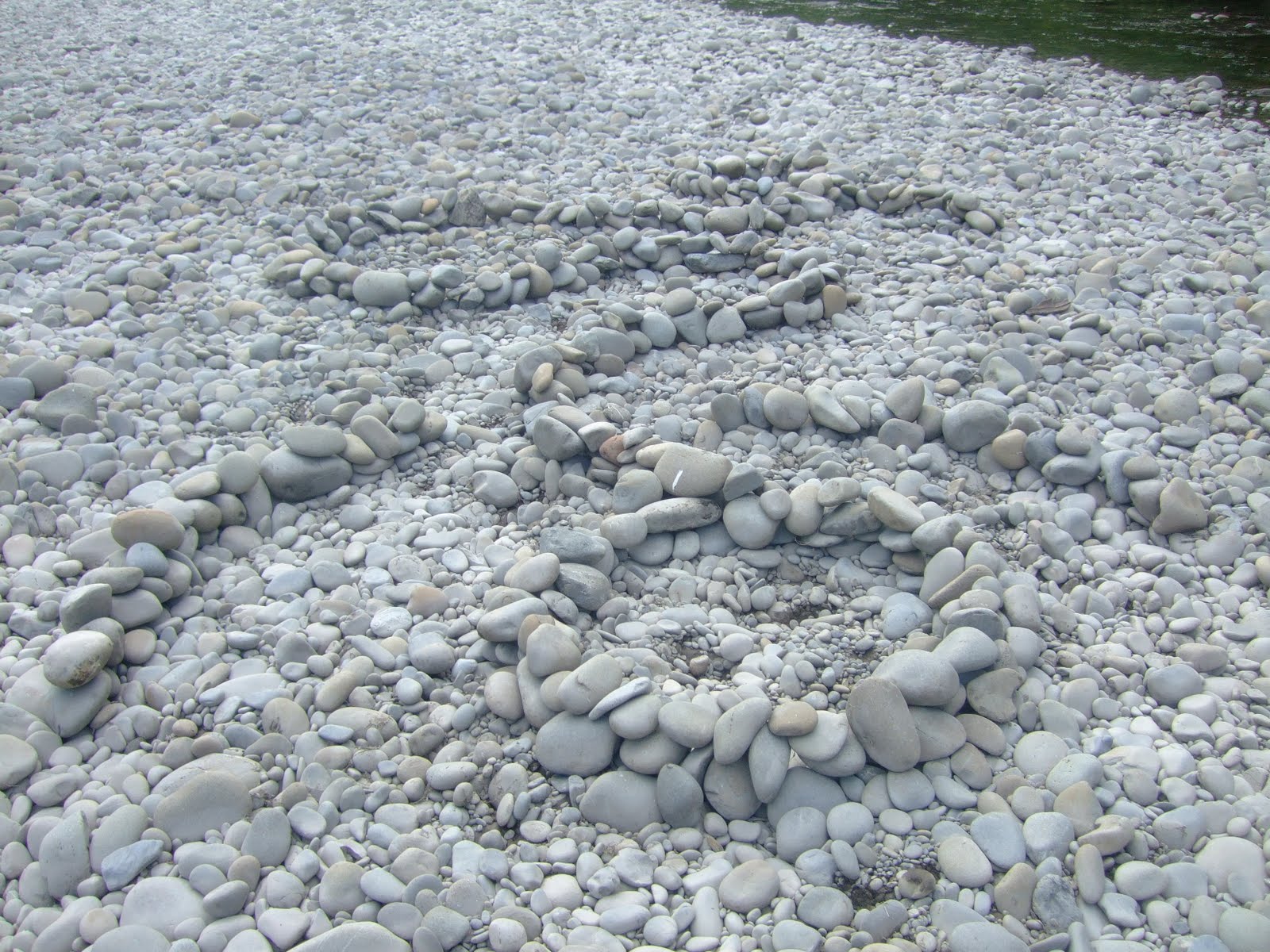
Rock arrangement in Hoh River (rock bar in middle of river) near Bogachiel Campground/State Park, WA. Design approximately 20'x15'. The shape is consistent with above pictures, although the perspective is reversed. The perspective is from the upstream view. The arrangement was done conscious of the river and that as it rises, the relief of the arranged rocks will show for a period of time as the water rises around it. Note: I did embellish this image with two arcs of stone near the base of the 'head' of the design.
Subscribe to:
Comments (Atom)