Showing posts with label acrylic. Show all posts

Sunday, February 26, 2012

Self-portrait

For awhile I've been interested in multi-color prints created from multiple screens or stencils to create a printed image with greater depth. Thanks again to Ed Roth's book Stencil 101 not for the stencils or stencil ideas in the book but for the materials lists including mylar and a stencil burner/cutter. I took the idea of mylar stencils to create my own multi-color prints. I chose a self-portrait based on a photograph. I played with the contrast, brightness, etc., of my photograph to create an image with four distinct values (translated as black, red, yellow and white). I used these color 'contours' to create my stencils in mylar. They were successively used to print images onto the black background. Opacity of the paint was critical in this process.

Self-portrait in four colors 1.  25cm x 19xm (image size). Acrylic on cold-press watercolor paper.
(Exposure digitally adjusted.)

Self-portrait in four colors 2.  25cm x 19xm (image size). Acrylic on cold-press watercolor paper.
(Exposure digitally adjusted.)

Sunday, February 12, 2012

Lincoln, Part II

I've spent the last couple weeks working on my first Lincoln picture. I opted for a light background with a dark Lincoln in the foreground. I'll reverse this with my next Lincoln picture.

One more time. ~72" x ~44" (smaller dimensions shown). Mixed media. Feb 2012. Digital adjustment: increased exposure due to poor lighting at time of snapshot.

I had other plans for the Lincoln stencil but after application of the paint, I think I'm happier with this. I may change it later and I'll post an update if I do. Below is a detail to give a better idea of the texture of the painting itself, which, I think, is difficult to see in the image above.

Detail of One more time. Detail is of area between Lincoln's eyes (Lincoln's left eye visible).

Monday, February 6, 2012

Mixed Media

Having spent time tediously, but rewardingly, working on my Lincoln and other projects, I decided to take some time to work out a non-stencil-based painting. The result is what follows.

into. 34" x 34". Mixed media.

The mixed media include spray, acrylic and household acrylic latex paints. Going into this painting I've been listening to The Antlers albums Burst Apart and Hospice. When I connect deeply with something I try to take notice. I sometimes wonder if it's my obsessive side showing and that time will render my current crushing interest passe, or is there something about hearing or seeing something right now, where I'm at that's important. It might not stay with me forever, but right now it connects. Either way, the honesty and vulnerability (in a good way) of the lyrics are refreshing and powerfully communicate loss, frustration, fear, and knowing yourself but making certain choices anyway. I think I'm at a point where I no longer see these things as good or bad but as experience. As I gain experience I feel richer, more grounded, more alive, more sad, more awake, more excited to be happy, to be hurt, to be flexible, to be mature, to have fun, to set high expectations, to fail in trying, to succeed exceptionally, to build a body of experience new, deep, and diverse.

Monday, December 26, 2011

On Burlap 3, Part 6

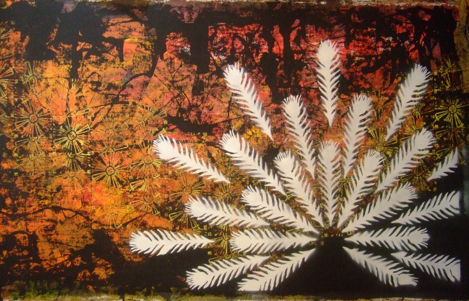
Work continues slowly. After cutting the stencil for the fan of feathers and placing it on the background, I found the Contact paper stencil was not adhering well to the acrylic (much of it had residual paper stuck to it). I left the picture alone for about 6 weeks while I tried to resolve the issue. Last week I was in a bookstore and came across Stencil 101 by Ed Roth. I was not interested in the included stencil. I was interested in a section describing the production of your own stencils. This hit me like a lightning bolt and I wondered, "Why has no one told me about this method before!?!" I read about Mylar sheets, stencil burners, pouncer brushes and spray-on, re-positionable adhesive! My answer was found. On the same trip I picked up all the supplies listed for future projects (Lincoln's head is on its way...), including the spray-on adhesive for use in this project. I carefully removed my stencil from the background, sprayed it with the adhesive, let it dry for sixty seconds (minimum) and replaced it on the background before applying the white spray paint. There were issues of the stencil not sticking in some places and the stencil curling in high-detail areas after the application of spray paint. This provided a nice amount of tolerable and interesting variation between feathers of the fan. After three coats of white paint I removed the stencil and the picture below is the result.

Have To (working title). 4'x7'.  Mixed media (acrylic, spray paint).

The next part will include the application of color, design and prints to the individual feathers. The final piece will be the character displaying the fan of feathers.

Monday, November 28, 2011

Small Work 2 + Tessellations

I continue to work on a couple small paintings. It's my palate cleanser and provides something to work on when I want more immediate results than my larger pieces (which are slowly coming along). I've used Contact paper to cover the acrylic and ink image, drawn on the plastic, removed it and cut it to provide custom pieces used for masking. It's allowed very clean lines and I've even masked some areas and stamped over the borders, allowing the creation depth in the picture. I've left the mask on the picture in the lower left corner of the painting. Once removed, the line of the central blue oval will be crisp.

Small painting. Blue Dot (working title). 24"x18". Mixed media.

I have recently been reading Designing Tessellations by Jinny Beyer. I've begun to design my own tiles and to print using some of the principles in the book. So far I'm liking the results.

A tile for tessellation. ~3.5" on a side.

Hexagonal tessellation pattern (eye-registered quick print).

I used the above tile for a background piece of a small (18"x24") watercolor. It's in early development. The tile is intended to create a string of crooked teeth, which will be replicated in the focal point of the painting. In this painting, too, I've used Contact paper for masking purposes.

Small watercolor/Rock Teeth (working title). Mixed media. 18"x24". Coldpress watercolor paper.

Wednesday, August 17, 2011

On Burlap 3, Part 3

After some thought, I decided to not use a word stamp on the background. That said, I decided to tackle a past issue of paper buckling when sprayed with spray paint by coating the stencil with contact paper.

Coating the stencil with contact paper.

After contact paper was applied, it was time to cut the stencil.

The completed stencil. (Note: I added stencil supports to the image which will be removed during the touch-up phase.)

Next I needed to set the stencil on the background prior to spraying with paint. I've had a problem in the past with the propellant in the spray paint lifting the stencil. To prevent this, I flipped the stencil and applied poster putty (or ticky tack, or sticky tack, or whatever it's called...) to several points of the stencil. I centered the stencil on the background and applied masking tape to supply extra hold for the stencil and to mask the background. Time to apply spray paint (white, gloss enamel paint).

Halfway through the first of three layers of spray paint.

The spray paint dried for about one half hour before removal of tape and stencil. Removal of poster putty took a few minutes. I found that the poster putty did prevent some lifting of the stencil, but the tenacious spray paint did manage to diffuse through some areas still.

Poorly lit photo of spray-painted image after removal of stencil and poster putty. (Note: the stencil supports are visible.)

The last step in preparation of the image was touch up of the image using tube acrylics, both black and white. White acrylic paint was applied with a size 6 filbert brush to both touch up the spray paint and to block out the stencil supports. Black acrylic paint (applied with the same brush) was used to touch up around areas where spray paint had diffused beyond the desired limit in order to add greater definition to the image. I have not decided whether or not I will stretch this onto a gallery frame or leave it as a roll-able piece of burlap. The title of the piece has changed from Open up to Brighter in the open. (I'll replace this picture in the next few days after I can photograph it in better light.)

Brighter in the open. 48"x24". Aug 2011.

As an end note, this picture of my wife was taken during a Bright Eyes concert at The Gorge at George, Washington at the Sasquatch Music Festival 2011.

Update:

This is the picture taken in better light.

Brighter in the open. 48"x24". Aug 2011.

Wednesday, July 6, 2011

Acrylics

I needed to paint something and this is the result. I'd recently spent several days in the rainforest and the woods near the ocean so I decided to do something that contrasted with all that green. The green does show in the painting, but, like a bright flower in the mountains, it is no more than a few freckles. The picture maintains a symmetry of balance from left to right in areas of shade and light. Again, out of contrast, the majority in this picture is light while certain smaller portions hold the shade.

NW Contrast. 24"x36".  Acrylic on canvas. July 2011.