Thursday, May 26, 2011

Printing

The day for printing arrived. Before printing, I had decided on some colors for the ink. Starting with very basic colors, my first task was to mix a shade of blue that would complement the blue woman's shirt and that be a bit darker. The second ink was more of a rust color and would be used in the print on the grey/charcoal shirt.
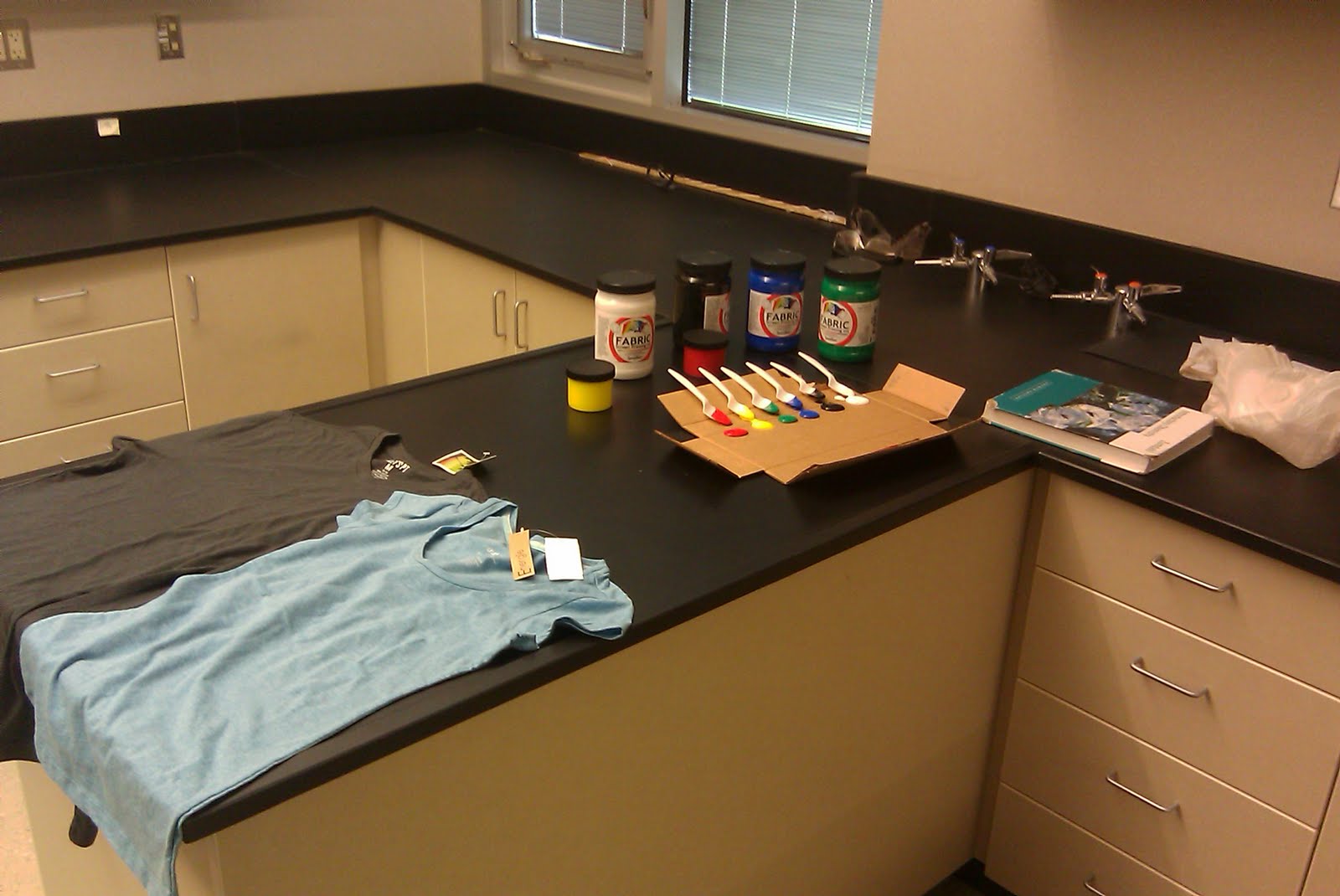
This is the area and the supplies needed for printing. No, I did not need the chemistry book, but it was there anyway.

In order to prepare the ink colors, I took a spoon of each color of ink and used a brush to mix the desired colors. After I achieved the desired color, I mixed the inks, but in greater quantity, in old, glass, baby food jars. Note: a little black goes a LONG way.

The first print done was the cog. The print was beautiful and came through with a bit of a stressed look due to uneven application of pressure with the squeegee during the spreading of the ink. After the print, however, there was a comedic mishap. The excess ink (see spoons above) was being put back into the bottles. As most 7th graders know but most adults forget, a plastic spoon bends well and, when bent, is potentially a functional and able catapult. Said spoon with white ink was bent while scraping ink back into the bottle, pressure of finger removed from end of spoon and the ink launches...into hair, onto counter and floor, onto shirt. We laughed. Really. And after we stopped laughing, a sponge, toothbrush and water were used to remove spots of white ink. Tomorrow, when the heat setting will be done, the print will be the only thing set, and, as a result, any remaining white ink will wash out with future laundering.

Close-up of the print. Speedball fabric inks were used.

The second shirt. I applied the ink for this print and made sure to evenly apply pressure with the squeegee. The result is a much more even print. However, because the print was slightly larger than the folded newspaper that was between the layers of fabric (to prevent the ink from soaking through the front of the shirt to the back) there is a spot of thicker ink near the right corner (bottom of picture) of the print.

This is a detail of the print from the above T-shirt.

Printing has been fun. Tomorrow I will heat set the images and the shirts will be ready for wearing to a music festival this weekend.

Wednesday, May 25, 2011

Exposure

I continued the process of development of the screens for printing. Below are pictures of the process of exposing the screen. I exposed the images for ~45 minutes each using a 150W incandescent light bulb. The screens were positioned about one foot below the light bulbs. Images were printed to transparencies first, laid on to the photo-emulsion coated screen, and covered with a pane of glass to hold the transparency tight to the screen.

A view of the setup. I'm using a plant grow station and the strong, 150W light bulbs that it uses. Notice that the rest of the room is dark.

This is a close up of the screen as it is being exposed. In this case I have two transparencies aligned to make a larger image. There are two pieces of glass because I did not have one large enough to cover the entire image. The seam where the panes of glass meet did not create an unexposed area.

UPDATE (26 May 2011): I made a rookie mistake which I will hopefully never make again. notice that the image has been exposed to read correctly "HSK." Problem: as exposed, the image would repeatedly print the mirror image of "HSK." This has since been remedied. I pulled off the tape, popped out the screen and reversed it, reinserted the spine, re-taped it and voila--good as gold. It's now ready for a production run of T-shirts next Wednesday.

The unexposed/shielded/blocked areas have been washed of the photo-emulsion. I found that using a gentle scrubbing motion with a semi-soft toothbrush worked well. I needed to scrub both sides of the screen on the unexposed areas to remove all of the unexposed photo-emulsion. The larger screen was more difficult and tedious because of all the tiny detail, but it will pay off when I print with it. On a side note, I might need to re-tape the screens and coat them with polyurethane....

The plan, now, is to print the images. I have a total of three screen ready for printing and hope to print two T-shirts (to wear to a music festival this coming weekend) and to try the larger image on a piece of paper. Now that I'm feeling much more comfortable with this process involving photo-emulsion, I hope to soon try this using a drawing fluid which can be used to draw directly onto the screens.

Tuesday, May 24, 2011

Designs III

Below are the further modifications and versions of prints I plan on silkscreening onto paper or clothing. All images below were taken with a either a 5MP cellphone camera or a FujiFilm F40fd camera. Images were digitally modified using a MacBook Pro using the native "Preview" software as well as Sketchbook Express. In most instances, gamma, saturation, exposure and contrast were modified.


The designs below are a direct continuation of the work of the two previous posts. I am close to deciding on a final design. At this point, I need final approval by the group and I will complete image and expose the silkscreen (photo-emulsion applied and waiting).


Updated 5/25/2011: Cog Crank picture modified and reposted. It did not have a portion of the left side of the picture so I cloned the fading shaded area from the right side and filled in the missing area on the left.

Sunday, May 22, 2011

Designs II

I've continued the design process and am near completion of the second part of the primary design. The following designs show the process. The individuals requesting the design wanted a ram's skull on an oval (representing a hackie sack). The requested initials are "HSK."


This is the third version of the sketch (I don't have a picture of the first version). It was done on regular printer paper using graphite. The drawing itself is approximately 22cm x 28cm.


This is the same image after adjustments to saturation, gamma, exposure, and color.

After some thought and wanting the image to appear if it was on a hackie sack, I photographed the sketch from an angle, adjusted colors, etc., and cleaned it up in Sketchbook Express using a MacBook Pro.

This image was also selected because of the better line quality achieved through brightness, saturation, etc., adjustments.

The image of the ram was then imported to its own layer in Sketchbook Express. I drew an oval (the hackie sack) in another layer. I moved the ram's head layer into position and erased white areas hanging outside the oval. I imported the HSK logo into its own layer and positioned it. This is final version 'one.'

This is final version 'two,' using the first ram's head image from above.

In addition to these variations, I redid the background image, making a correction of a flaw (in the K of the HSK of the first column).

I'll post more pictures as I work through the exposure of the silkscreen and then the printing process.

Wednesday, May 18, 2011

Designs

The following are a series of sketches for a T-shirt that I've been asked to design. They illustrate the process well of starting with a sketch and ending with a nice pattern (which will be further modified) for silkscreening.


Initial sketch on printer paper with graphite. ~5cm x ~14cm


Photo of image (with cell phone) with contrast, brightness, saturation and gamma adjusted.


Same image after touchups using Sketchbook Express.


More touchups using Sketchbook Express.


Image cropped and ready for cutting and pasting.


Repeated image, ready for further processing prior to silkscreening.

I'll try to post updates as the this project progresses. The process should be complete within the next two weeks.


Monday, May 9, 2011

New views

I continue to create, but not all is visual art. Work takes time. Good work takes more. Creation of curriculum, professional documents and the time it takes to shape young minds consumes me. The pen has kissed the paper in the last month to form shapes and shadows. At this point it I have design. Designs. And more ideas waiting for execution. The attached picture is a collection of sketches in need of development. It's a start.
Untitled Prismacolor ink sketch in Moleskine notebook (~10"x~8")